National Network of Abortion Funds
Post-Dobbs, a groundswell of support for abortion justice thrust the National Network of Abortion Funds (NNAF) into the spotlight like never before.
During the initial discovery period, we determined that there was inherently a tension between the activist audience and the “caller” audience - meaning the audience that regularly calls abortion funds looking for help accessing an abortion. Given the importance of NNAF’s work and mission, we determined that the best course of action would be to separate these two pathways and give greater prominence to the caller's needs.
Clarifying Audience Needs
The best way to help callers was to ensure that they could browse a list of all abortion funds that could possibly support them. The previous “Find a Fund” experience relied on a map-based UI, which created the misconception that the best fund is likely the closest one. In reality, abortion funds provide a variety of different services, ranging from financial support to transportation to child care, and can serve multiple states or vulnerable populations. The new search experience would have to explain the different roles abortion funds can provide while helping users understand that there are more options available than just those close to them.
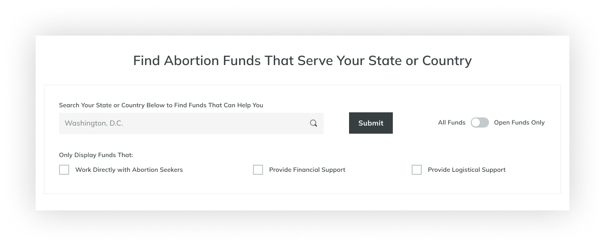
We introduced a search that would query the newly created “areas served” field so that users could input their location and, instead of just seeing the closest funds, they would see a list of all funds that could help them, along with a listing style that provided additional criteria users could scan to differentiate their options.
Prioritizing What Matters
NNAF originally shared a list of 28 different services that funds could provide. Knowing that the caller audience may be sensitive to being overwhelmed if we presented all of the available options at once, we paid specific attention to filter design. Working with their team, we developed three overarching categories that spoke to the distinct categories of support funds could offer. These became the search filters - allowing users to more quickly and efficiently find the right option without being overwhelmed. Finding a place to list the specifics was still important, so we designed a listing component on Fund Profile pages that detailed all of the services provided by that Fund.
Finding the Right Filters
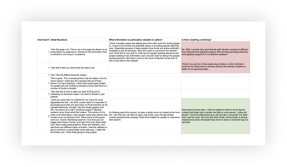
To ensure this experience was successful and easily understood, we conducted several rounds of usability testing on both a low-fidelity prototype and the live website. These tests focused on ensuring users had enough context to understand the different options available to them as they searched for abortion funds based on a variety of prompts.
Through these tests, we realized we would need to add an explainer component toward the top of the page to provide more context around the filter options to explain the fact that abortion funds could, in fact, help with things like transportation and child care. We also determined that we should provide a default value in the search field to reinforce the idea that users should search for their location, not a fund’s.
Testing and Validation
You can view the live website here.
Client: National Network of Abortion Funds
This was created during my time at Threespot.
About the Project
Thank you to:
Lizzy Cederberg, Producer
Clare Mahr, Visual Designer
Megan Lewin-Smith, Visual Designer
Nora Chovanec, Creative Director
Sarah Greene, Developer
Amaka Mgboji, Developer


